Line Charts
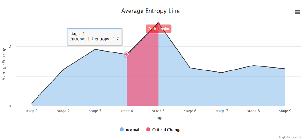
The x-axis represents the different stages of the disease, and the y-axis represents the average SLE score of different samples in the same stage..
The x-axis represents the different stages of the disease, and the y-axis represents the average SLE score of different samples in the same stage..